Background
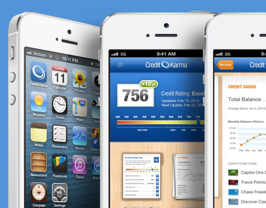
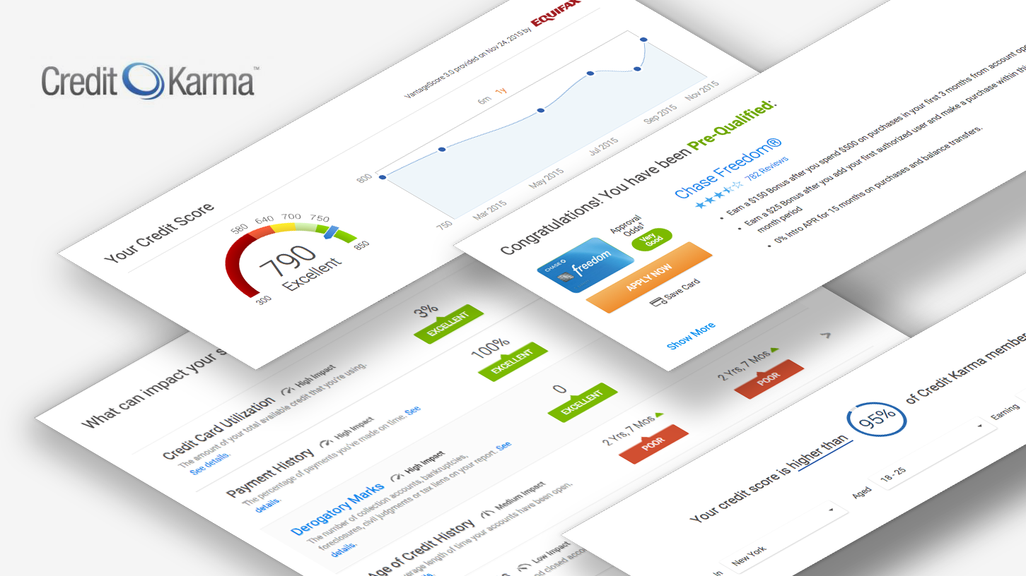
In 2015 the product and company expanded in scale significantly. In addition to incorporating a second complete set of user data from a new bureau, the experience architecture was expanded to include a live feed layer. The hub - the most trafficked page with the longest engagement, was changed from a dashboard to a feed. As was our custom, the launch of a major new product would coincide with an end-to-end visual redesign of the UI.
My Role
Being part of the strategy, I led my team to make preparations for this change. I convinced leadership to make the first UX research hire. I went a bit outside of process and hacked together a test style guide with a top front end engineer.
Approach
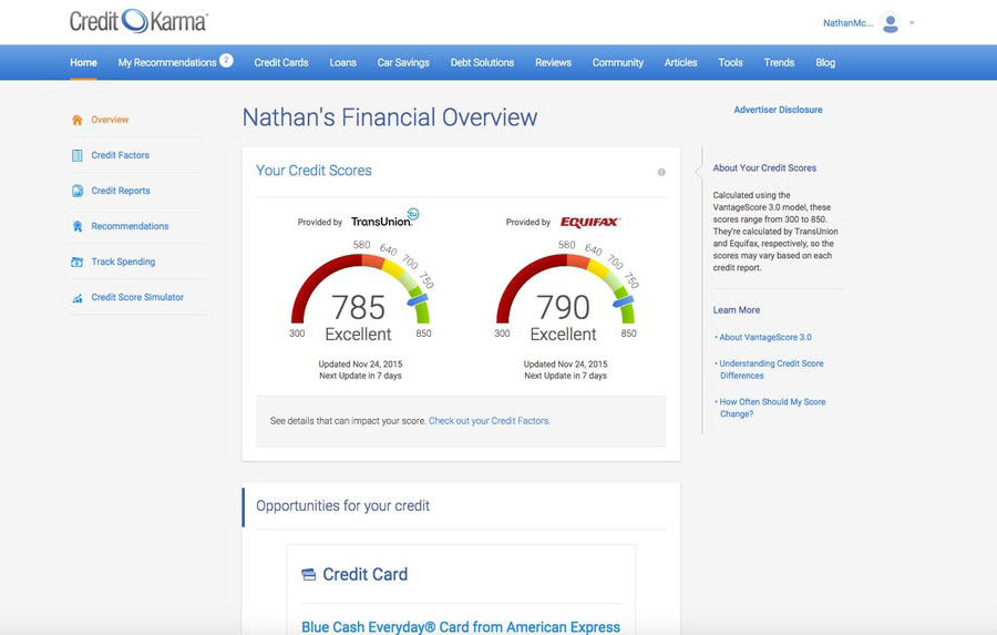
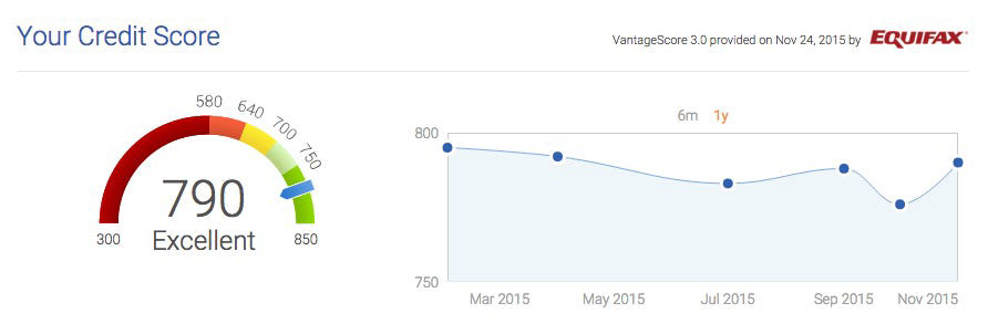
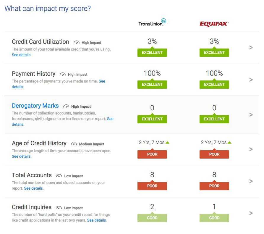
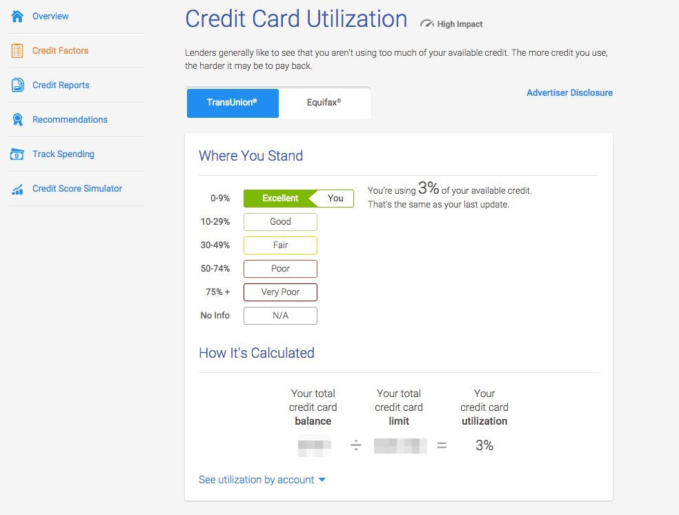
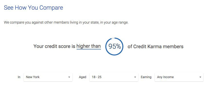
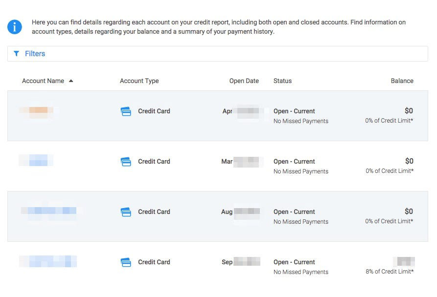
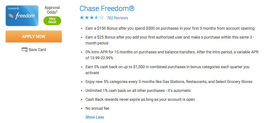
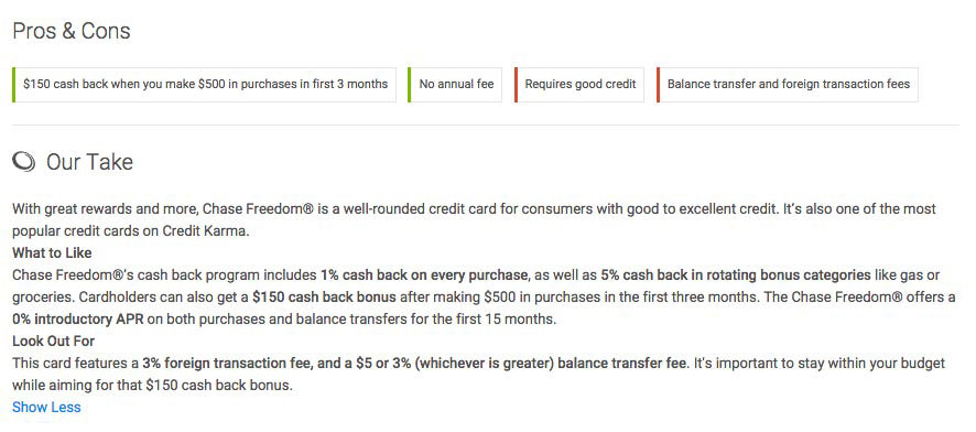
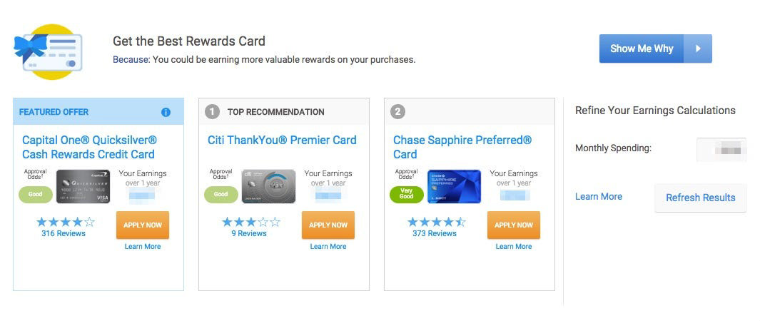
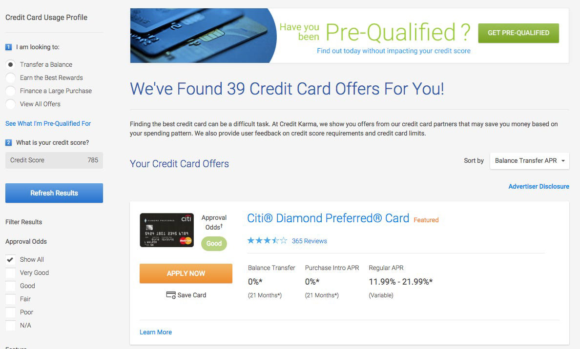
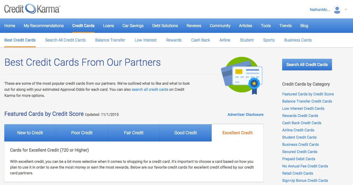
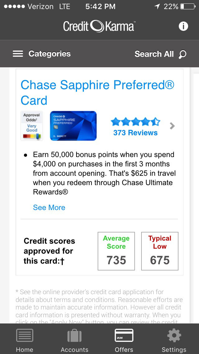
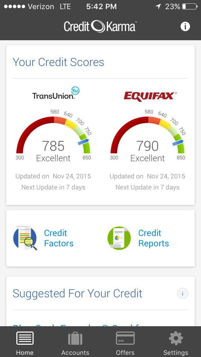
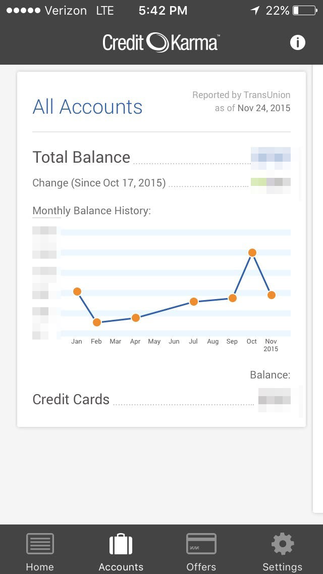
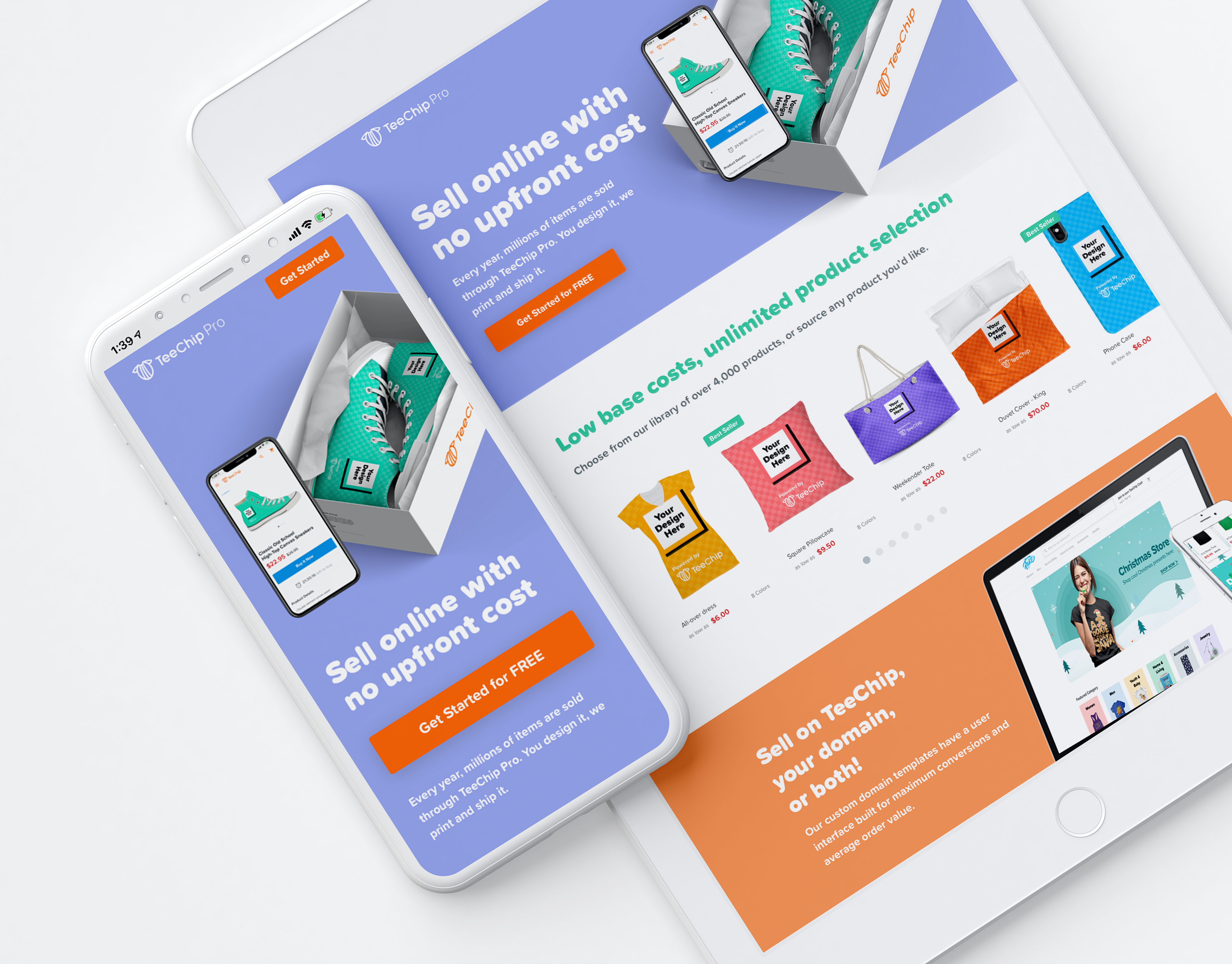
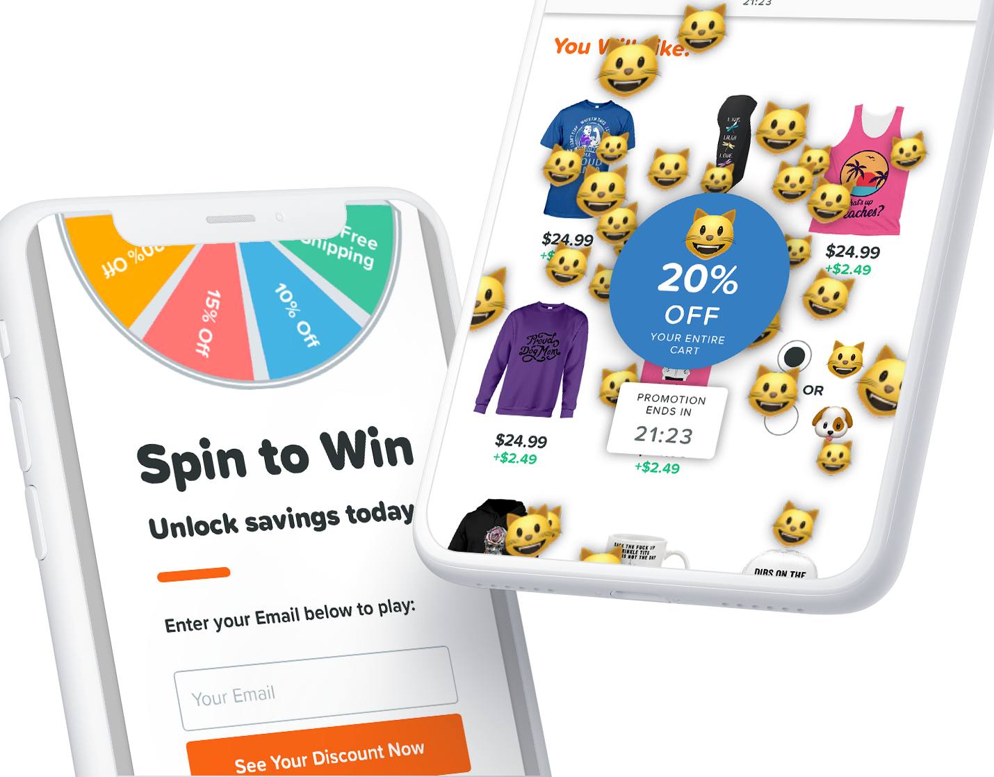
A card based design system seemed like the right strategy, and is what ck still uses. Cards on the dashboard included content, credit information changes, important transactions, recommendations, news, etc. Cards on the marketplace supported comparative data displays. Cards in the highly detailed credit information section supported the chunking of information to reduce cognitive load. All cards were responsive for different screen sizes, and—best of all—any card could be A/B tested against another card.
With this - designers started moving, paired with their PMs and charged with ideating and wire-framing in medium fidelity, while they each experimented with their own versions of visual design. As design progressed we identified representative screens at the core of the experience for each designer. Those screens were compared, iterated upon for consistency, and turned into a full pattern library, which was then used by designers to continue subpages. Eventually the style guide was fully functional and designers and PMs were able to accelerate their product development cycles.
Results
The company raised a $175 million Series D funding round, bringing its total equity funding to $368.5 million and its valuation to $3.5 billion.